

![Creating Stunning Image Grid Layouts in Liquid [For Shopify] - Grid Gallery🌟](https://cdn.hashnode.com/res/hashnode/image/upload/v1691747664526/90db27ad-f251-427a-8f85-c353c79433e8.png?w=1600&h=840&fit=crop&crop=entropy&auto=compress,format&format=webp)


Are you looking to add a touch of creativity and style to your Shopify store? Do you want to showcase your products or content in an eye-catching grid layout? Look no further! In this blog post, we'll walk you through creating a custom Shopify section called "Grid Gallery - GG" that allows you to effortlessly design stunning Image grid layouts for your online store. ✨🛍️
Step 1: Writing Schema 📝
The first step in creating our Grid Gallery is defining the schema. This schema will serve as the blueprint for our custom section, providing settings and blocks that can be customized. Let's take a look at the schema:
{% schema %}
  {
    "name": "Grid Gallery [GG]",
    "settings": [
      {
        "type": "header",
        "content": "Grid Settings"
      },
      {
        "id": "grid-columns",
        "type": "text",
        "label": "Grid Template Columns",
        "default": "1fr 1fr 1fr"
      },
      {
        "id": "grid-height",
        "type": "text",
        "label": "Container Height",
        "default": "auto"
      },
      {
        "type": "header",
        "content": "Colors"
      },
      {
        "type": "color",
        "id": "text_color",
        "label": "Text Color",
        "default": "#ffffff"
      },
      {
        "type": "color",
        "id": "background_and_overlay_color",
        "label": "Background & Overlay Color",
        "default": "#000000"
      },
      {
        "type": "color",
        "id": "on_hover_color",
        "label": "Button Hover Color",
        "default": "#f7e8b5"
      }
    ],
    "blocks": [
        {
          "name": "Grid Text Item",
          "type": "grid-text-item",
          "settings": [
            {
              "id": "text",
              "type": "text",
              "label": "Title",
              "default": "Title Here"
            },
            {
              "id": "subtitle",
              "type": "text",
              "label": "subtitle",
              "default": "Subtitle Here"
            },
            {
              "id": "button-text",
              "type": "text",
              "label": "Button Title",
              "default": "button"
            },
            {
              "id": "button-url",
              "type": "url",
              "label": "Button URL"
            },
            {
              "type": "number",
              "id": "grid-span",
              "label": "Grid Span",
              "default": 1
            }
          ]
        },
        {
          "name": "Grid Image Item",
          "type": "grid-image-item",
          "settings": [
            {
              "type": "image_picker",
              "id": "image",
              "label": "Image"
            },
            {
              "type": "text",
              "id": "text",
              "label": "Text",
              "default": "Text"
            },
            {
              "type": "url",
              "id": "grid-url",
              "label": "Image URL"
            },
            {
              "type": "number",
              "id": "grid-span",
              "label": "Grid Span",
              "default": 1
            },
            {
              "type": "text",
              "id": "image-width",
              "label": "Image Width",
              "default": "100%"
            },
            {
              "type": "text",
              "id": "image-height",
              "label": "Image Height",
              "default": "100%"
            },
            {
              "type": "text",
              "id": "object-fit",
              "label": "Object Fit Property",
              "default": "cover"
            }
          ]
        }
    ],
    "presets": [
      {
        "name": "Grid Gallery [mrh]",
        "category": "MRH Sections"
      }
    ]
  }

{% endschema %}
This schema defines the settings and blocks that will be available in our custom section. We can customize the grid layout, colors, and other visual aspects according to their preferences.
Step 2: Implementing the HTML Structure 🏗️
Now that we have defined our schema, let's move on to implementing the HTML structure for our Grid Gallery. We'll iterate through the blocks in the section and display the content accordingly. For the 'grid-text-item' block type, we'll display a text container with a title, subtitle, and button.
Here's the HTML code (will add further modifications):
<div
    id="gg--container"
>

    {% for block in section.blocks %}
        {% case block.type %}
            {% when 'grid-text-item' %}
                <div class="gg--text-container">
                    <h2> {{ block.settings['text'] }} </h2>
                    <p> {{ block.settings['subtitle'] }} </p>
                    <a href="{{ block.settings['button-url'] }}">
                        {{ block.settings['button-text'] }}
                    </a>
                </div>
        {% endcase %}
    {% endfor %}

</div>
Step 3: Styling Your Grid Layout 🎨
Let's add some CSS for the elements we have added till now. We'll define styles for the container, text container, and button hover effects.
Here's the CSS code:
{%- style -%}

#gg--container {
    display: grid;
    gap: 4px 4px;
    grid-auto-flow: row;
}

.gg--text-container {

    background-color: {{ section.settings['background_and_overlay_color'] }};
    color: {{ section.settings['text_color'] }};
    display: flex;
    flex-direction: column;
    justify-content: center;
    align-items: center;
    padding: 15px;
}

.gg--text-container * {
    margin: 0px;
    color: {{ section.settings['text_color'] }}
}

.gg--text-container a {
    text-decoration: none;
    color: {{ section.settings['text_color'] }};
    border: 1px solid {{ section.settings['text_color'] }};
    padding: 2px 5px;
    transition: all 0.3s ease-in;
    font-weight: bold;
}

.gg--text-container a:hover {
    color: {{ section.settings['background_and_overlay_color'] }};
    background-color: {{ section.settings['on_hover_color'] }};
    border-color: {{ section.settings['on_hover_color'] }};
}

@media screen and (max-width: 480px) {
    #gg--container {
        display: block;
    }

    .gg--text-container {
        padding: 50px 5px;
    }
}

{%- endstyle -%}
Step 4: Applying Liquid Logic 🧪
Liquid logic enables dynamic behavior and data manipulation in the Shopify theme. In this step, we'll use Liquid to create the grid rows and assign grid areas for each block in the section.
Here's the Liquid code:
{% assign template_grid_row = '' %}
{% assign total_columns = section.settings['grid-columns'] | split: ' ' | size %}

{% assign total_item_container = 0 %}
{% for block in section.blocks %}
  {% assign total_item_container = total_item_container | plus: block.settings['grid-span'] %}
{% endfor %}

{% assign total_columns_float = total_columns | times: 1.0  %}
{% assign total_rows =  total_item_container | divided_by: total_columns_float | ceil %}


{% assign grid_rows = '' %}
{% for i in (1..total_rows) %}
  {% assign grid_rows = grid_rows | append: 'auto ' %}
{% endfor %}

{% assign column_counter = 0 %}
{% assign row_counter = 1 %}

{% for block in section.blocks %}
    {% for i in (1..block.settings['grid-span']) %}


      {% assign template_grid_row = template_grid_row | append: 'block-' | append: block.id %}

      {% assign column_counter = column_counter | plus: 1 %}

      {% if column_counter == total_columns %}

            {% assign column_counter = 0 %}

            {% if row_counter != total_rows %}

                {% assign template_grid_row = template_grid_row | append: ', ' %}
                {% assign row_counter = row_counter | plus: 1 %}

            {% endif %}

            {% else %}
                {% assign template_grid_row = template_grid_row | append: ' ' %}

      {% endif %}

    {% endfor %}
{% endfor %}

{% assign total_containers = total_rows | times: total_columns %}
{% assign x = total_containers | minus: total_item_container %}


{% for i in (1..x) %}
  {% assign template_grid_row = template_grid_row | append: ' auto' %}
{% endfor %}

{% assign template_grid_row__ = template_grid_row | split: ',' %}
{% assign template_grid_row__prop = '' %}

{% for i in template_grid_row__ %}

    {% capture prop %}
        "{{ i | strip }}"
    {% endcapture %}

    {% assign template_grid_row__prop = template_grid_row__prop | append: prop | append: ' ' %}

{% endfor %}
Step 5: Extending the HTML with Liquid and Styling ✨
With our Liquid logic ready, we can now enhance the HTML structure to incorporate dynamic grid areas based on the user's settings. Additionally, we'll apply specific styling for the 'grid-image-item' block type.
Here's how the updated HTML and CSS sections look:
<div
    id="gg--container"
    style='
        grid-template-columns: {{ section.settings["grid-columns"] }};
        grid-template-rows: {{ grid_rows }};
        grid-template-areas: {{ template_grid_row__prop }};
    '
>

    {% for block in section.blocks %}
        {% case block.type %}
            {% when 'grid-text-item' %}
                <div
                    class="gg--text-container block-{{ block.id }}"
                    style="grid-area: block-{{ block.id }};"
                >
                    <h2> {{ block.settings['text'] }} </h2>
                    <p> {{ block.settings['subtitle'] }} </p>
                    <a href="{{ block.settings['button-url'] }}">
                        {{ block.settings['button-text'] }}
                    </a>
                </div>
            {% when 'grid-image-item' %}
            <div
                class="gg--image-container block-{{ block.id }}"
                style="grid-area: block-{{ block.id }};"
            >
                <a href="{{ block.settings['grid-url'] }}">
                    <img
                        src="{{ block.settings['image'] | image_url }}"
                        loading="lazy"
                        width="{{ block.settings['image-width'] }}"
                        height="{{ block.settings['image-height'] }}"
                        style="object-fit: {{ block.settings['object-fit'] }};"
                    >
                </a>
                <p class="gg--image-container--p">{{ block.settings['text'] }}</p>
            </div>
        {% endcase %}
    {% endfor %}

</div>
/* Previous CSS Rules */
.gg--image-container {
    position: relative;
    overflow: hidden;
    transition: all 0.4s ease-in;
}
.gg--image-container img {
    transition: all 0.5s ease-in;
}
.gg--image-container a:hover + .gg--image-container--p {
    opacity: 1
}
.gg--image-container--p {
    opacity: 0;
    position: absolute;
    top: 50%;
    left: 50%;
    transform: translate(-50%, -50%);
    padding: 5px 10px;
    font-weight: bold;
    color: {{ section.settings['text_color'] }};
    border: 2px solid {{ section.settings['text_color'] }};
    pointer-events: none;
    transition: all 0.5s ease-in;
}
@media screen and (min-width: 480px){

    .gg--image-container:hover {
        background-color: {{ section.settings['background_and_overlay_color'] }}
    }

    .gg--image-container img:hover {
        transform: scale(1.2);
        opacity: 0.2;
    }

    #gg--container {
      height: {{ section.settings['grid-height'] }}
    }

}
@media screen and (max-width: 480px){

    /* Previous CSS Rules */

    .gg--image-container--p {
        opacity: 1;
        background-color: {{ section.settings['background_and_overlay_color'] }}
    }

}
Conclusion 🎉
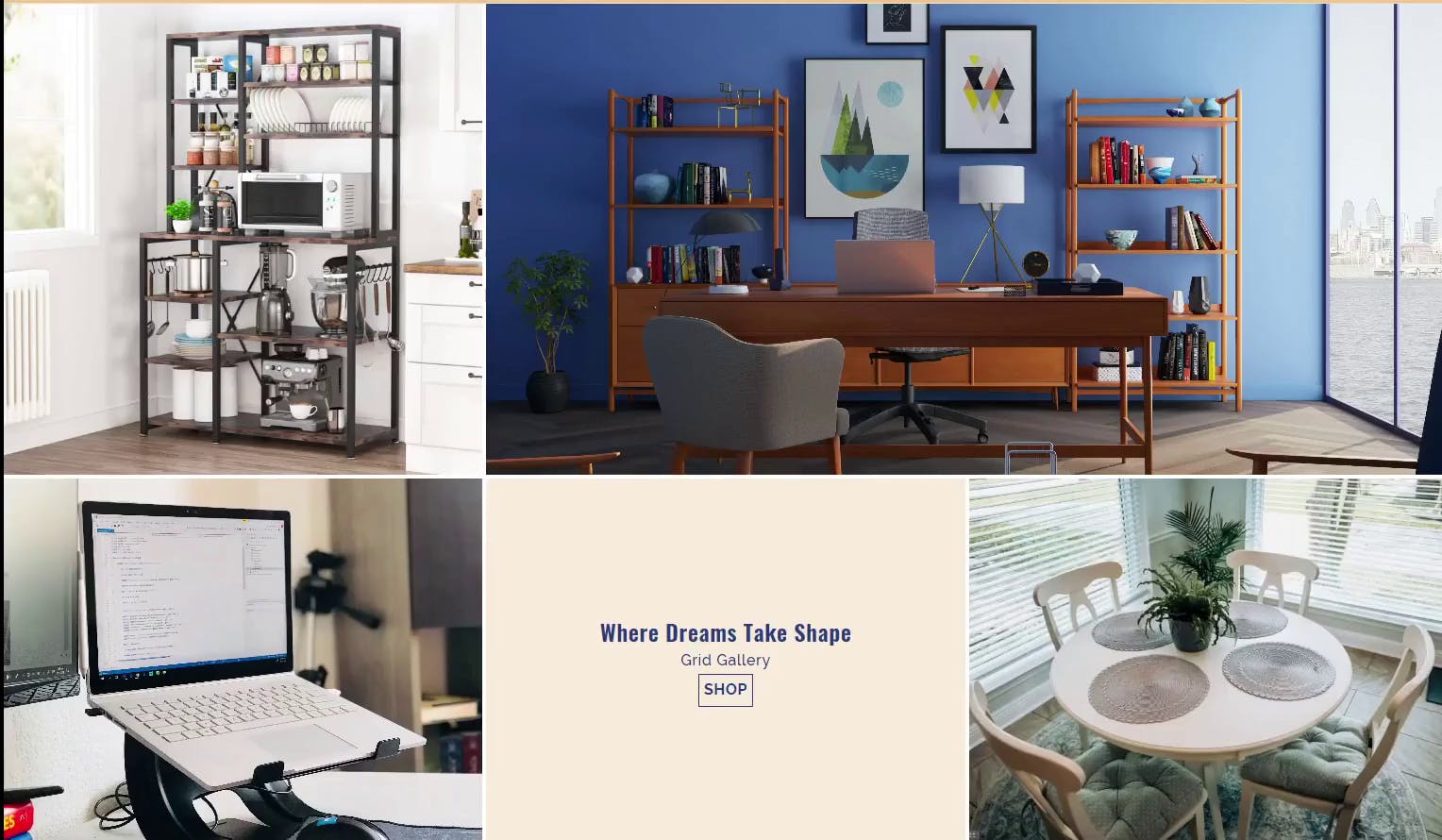
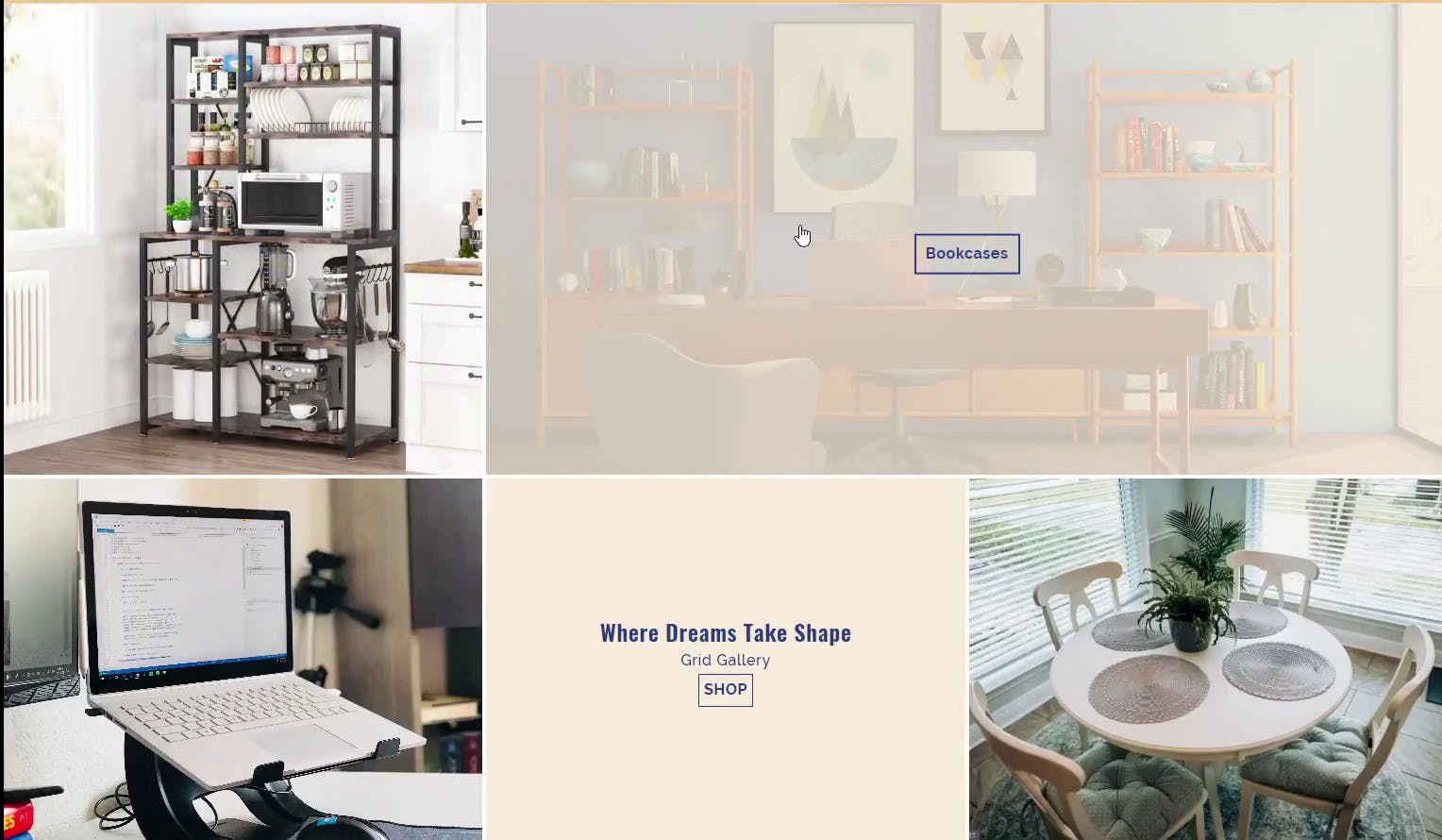
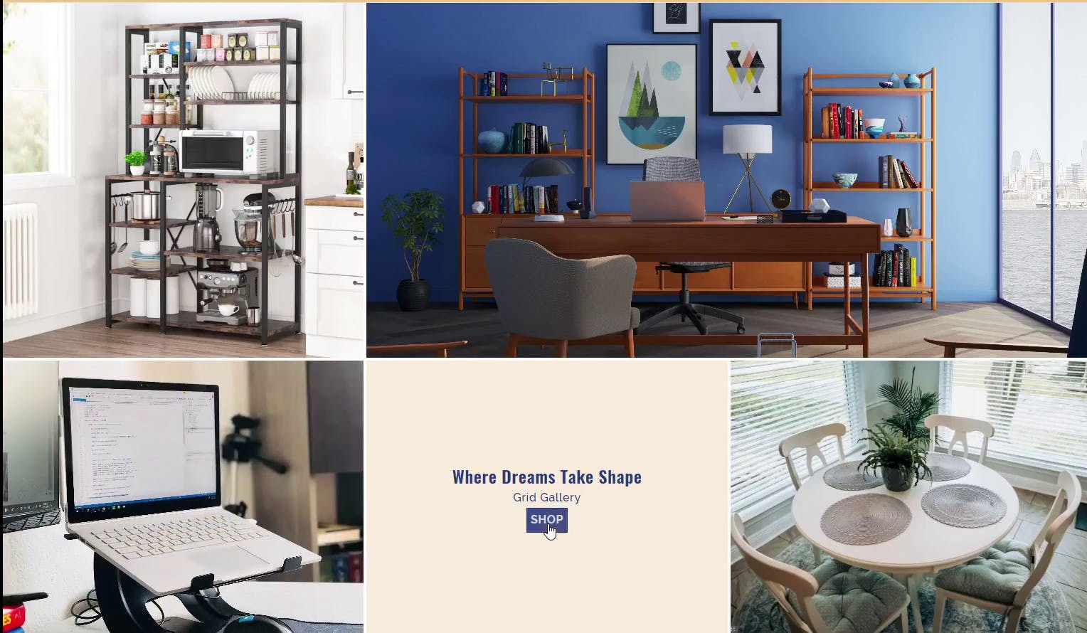
Congratulations! We've just created a stunning and customizable Grid Gallery custom section for our Shopify store. By following these steps, you've learned how to define the schema, implement the HTML structure, apply dynamic Liquid logic, and add stylish CSS to make your grid layout visually appealing. Now, you can easily showcase your images in a beautiful grid format that's sure to captivate your visitors. Get creative, experiment with different settings and styles, and watch your Shopify store come to life with colorful and dynamic grid layouts.